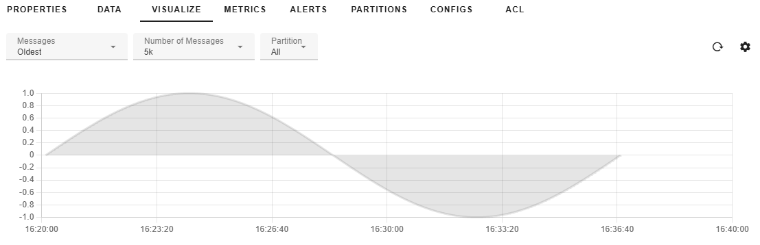
Visualizing Apache Kafka® data in a graphical format usually involves setting up several software components on top of Kafka itself, including Kafka Connect, Prometheus, Grafana, etc. With gradient fox you can skip the installation and maintenance of those extra components and visualize your topic data in seconds. The data for your graphs can be stored in several supported formats, including JSON, Avro or Protobuf. Below you see an example graph with one data series.
You can also show multiple data series simultaneously. Different series can be based on the partition number or on a value of a field in JSON, Avro or Protobuf message. See the Data Series section below for more details.
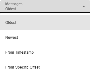
The Messages-dropdown allows you to select which messages within your topic you want to visualize. It has the following options to choose from.
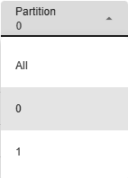
The Partition-dropdown lets you select which partition to visualize the messages from. By default, All is selected so you will visualize messages from all partitions of your topic.
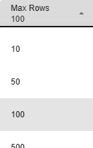
The Max Rows-dropdown lets you choose how many messages will be scanned to visualize your graph. Selecting a higher value will take more time to fetch and render.
The values of the X-axis are expected to be datetime values. By default, the timestamp of the message is used as the timestamp of each data point in the graph. The timestamp can also come from the message itself, either the key or the value. In that case, the value must be an integer or datetime formatted string. You can change the source of the x-axis timestamp by clicking on the settings gear-icon in the upper right-hand corner and navigating to the x-axis tab.
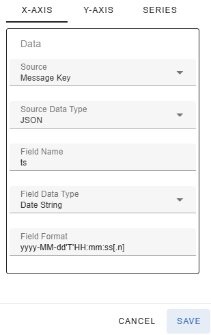
The Source-dropdown allows you to configure where the data for the x-axis comes from. The following values are available
If you select Header as the Source, you must enter the name of the header that contains the x-axis value in the Header Name text box.
If you select either Header, Message Key or Value, the Source Data Type dropdown showing the format of the header/key/message will be displayed. The following values are available
If you select a structured format (JSON, Avro or Protobuf) for the key/value you must enter the name of the field that contains the timestamp in the Field Name text box.
If you do not use the message timestamp as the x-axis value, you need to specify what is the data type of the timestamp using the Field Data Type dropdown. The following values are available
If you selected Date String in the Field Data Type dropdown, you must enter the format in the Field Format text box. The format must follow the pattern accepted by the Java DateTimeFormatter class.
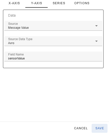
The values in the y-axis are expected to be numbers, either integers or decimal numbers. The value for the y-axis number can come from the message key or value.
The Source-dropdown allows you to configure where the data for the y-axis comes from. The following values are available
If you select Header as the Source, you must enter the name of the header that contains the y-axis value in the Header Name text box.
You must also specify the format of the header/key/value of the message in the Source Data Type dropdown. The following values are available
If you select a structured format (JSON, Avro or Protobuf) for the key/value, you must enter the name of the field that contains the y-axis value in the Field Name text box.
Notice that the values for the x and y axes can both come from the same source (e.g. message value) if the content is a structured value (e.g. JSON) and the value contains separate fields for the x-axis timestamp and the y-axis numeric value. For example, the below JSON object could be stored in either message key or message value. The x-axis value would come from the timestamp field and the y-axis value would come from the value field.
{
  "sensor": 2,
  "timestamp": "2025-07-17T12:08:18.477",
  "value": 0.003015957963987727
}
By default the data contained in the processed messages is assumed to represent a single data series. It is possible however, that the data stored in the topic contains multiple data series. Using the previous example JSON message, the sensor field could contain the value of the data series
{
  "sensor": 2,
  "timestamp": "2025-07-17T12:08:18.477",
  "value": 0.003015957963987727
}
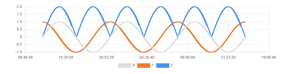
The below graph shows an example with three different data series, each representing the sensor number stored in the JSON field with the same name. Notice that you can show/hide individual data series from the graph by clicking on it in the legend that is displayed below the graph.
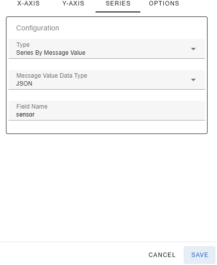
The source of the data series discriminator can be configured in the Settings-dialog under the Series tab. The Type dropdown lets you select where the differentiator for the data series is stored. The following values are available
If you select Header as the Source, you must enter the name of the header that contains the discriminator value in the Header Name text box.
If you select either Series By Header, Message Key or Value, the Data Type dropdown showing the format of the header/key/message will be displayed. The following values are available
If you select a structured format (JSON, Avro or Protobuf) for the key/value you must enter the name of the field that contains the discriminator value in the Field Name text box.
If you select a large data set (number of rows) to visualize, the graph can become hard to read and/or sluggish to render. You may even get errors trying to display the graph. For example, the picture below shows a graph that contains so many data points that it is extremely sluggish to render and resize.
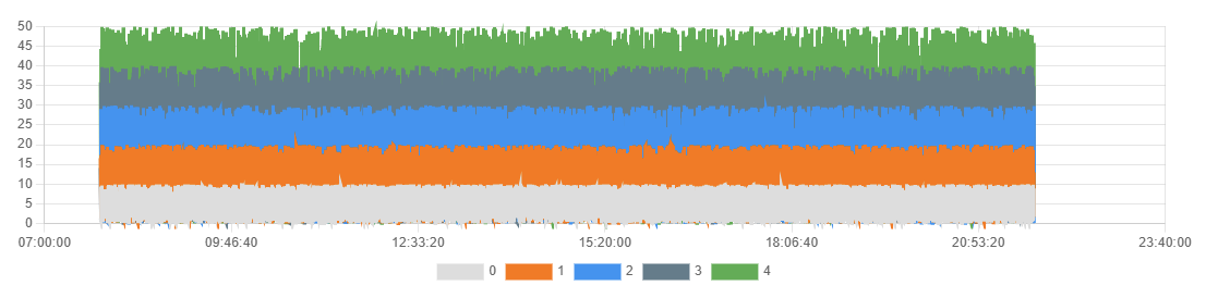
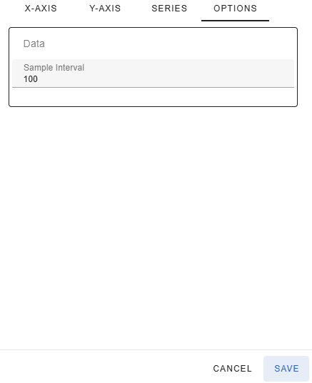
To speed up the rendering of the graph, there are basically two options. You can select fewer messages to process, or you may select to sample every Nth message. The above graph is shown below with the sample interval of 100. In other words it contains 1% of the data points of the graph above, but you can still see the same trends and the rendering is much quicker.
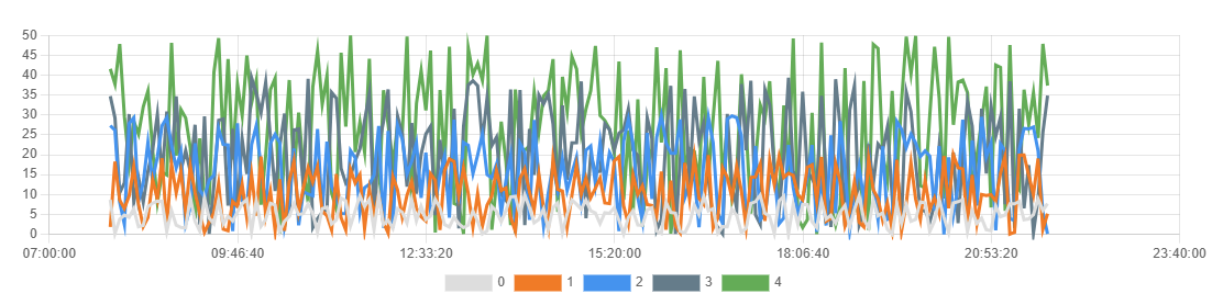
The sample interval can be configured in the Settings-dialog under the Options-tab. The default sample interval is 1, which means every message will be plotted. The entered sample interval cannot exceed 10% of the number of rows. In other words, if you are visualizing 1000 messages, the maximum sample interval is 100. This would result in 10 data points for your graph.